Spotify Rebrand


Spotify Rebrand
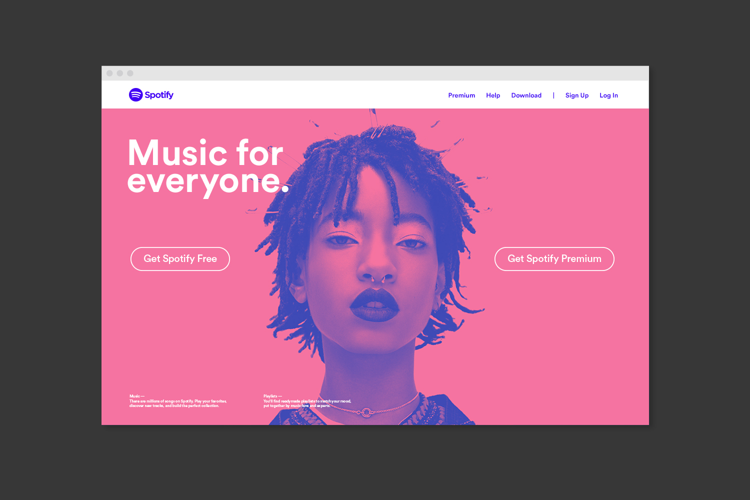
Music is transformational — it can sustain or change your emotional state in mere seconds. However, when Spotify was launching, the music market was oversaturated with entrants like Beats and Deezer, thus degrading the meaning and personal value of the art. Coupling that with the fact that people seek products that can anticipate them throughout the day — running, waking up, working — we developed a strategy to guide our design: Make Music Personal Again.
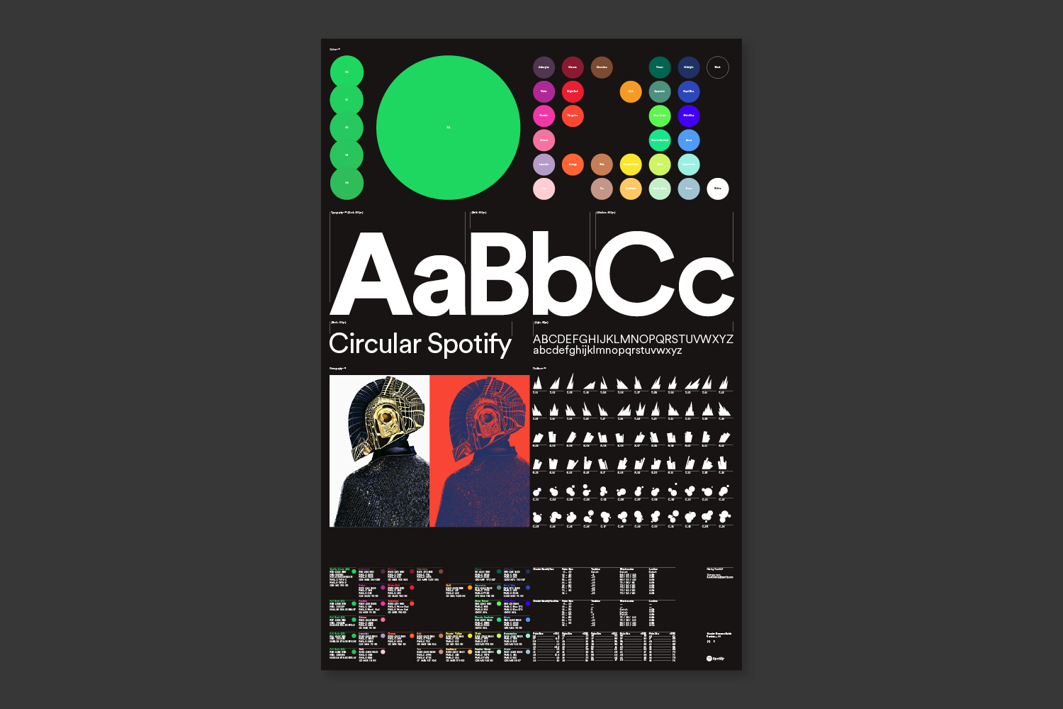
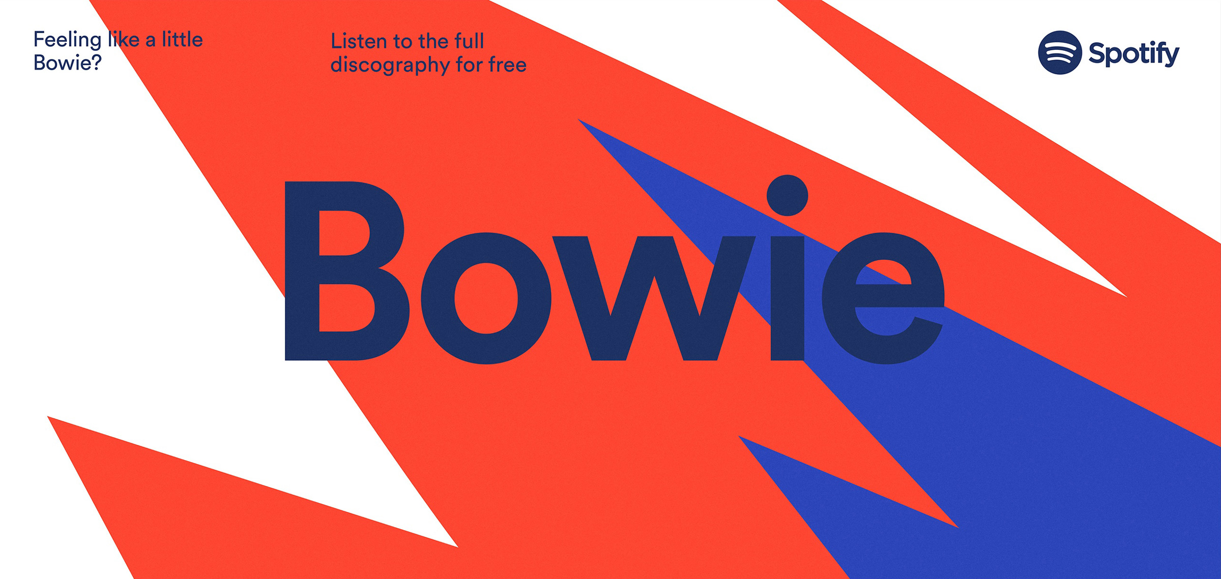
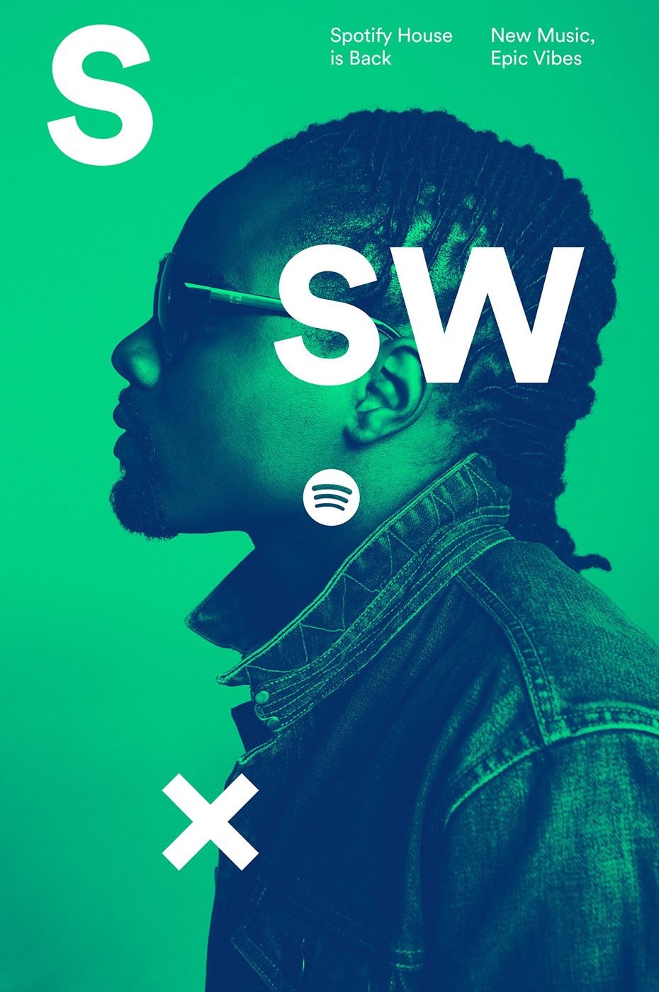
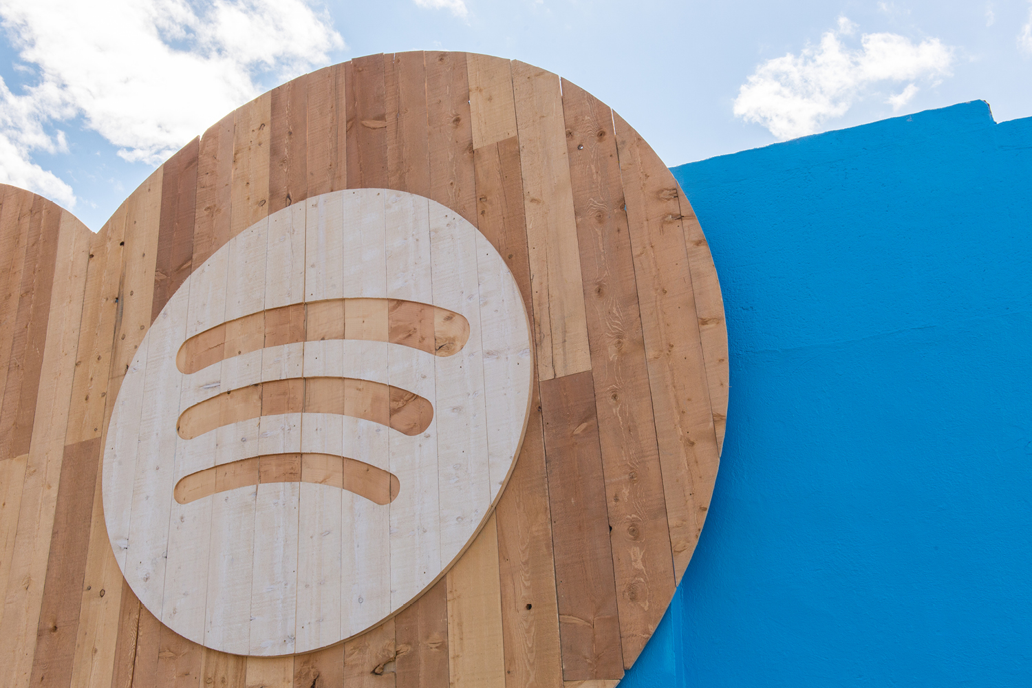
In the ‘70s, the Fillmore created posters that simultaneously expressed the performer and venue through design. We found inspiration in this approach and injected new energy and rhythm into the Spotify brand. We established a color palette, graphic elements, typography, photography and treatments, developing a unique language for Spotify to communicate with globally. These are elements of a system which lives on product, communications and environments, including their namesake SXSW House, Sessions and international launches.
Music is transformational — it can sustain or change your emotional state in mere seconds. However, when Spotify was launching, the music market was oversaturated with entrants like Beats and Deezer, thus degrading the meaning and personal value of the art. Coupling that with the fact that people seek products that can anticipate them throughout the day — running, waking up, working — we developed a strategy to guide our design: Make Music Personal Again.
In the ‘70s, the Fillmore created posters that simultaneously expressed the performer and venue through design. We found inspiration in this approach and injected new energy and rhythm into the Spotify brand. We established a color palette, graphic elements, typography, photography and treatments, developing a unique language for Spotify to communicate with globally. These are elements of a system which lives on product, communications and environments, including their namesake SXSW House, Sessions and international launches.
Credits
Lee Maschmeyer, Creative Director
Ben Crick, Design Director
Christian Widlic, Senior Designer
COLLINS
Lee Maschmeyer, Creative Director
Ben Crick, Design Director
Christian Widlic, Senior Designer
COLLINS